ROLES
UX Research, Wayfinding Design
TEAM
Solo
TIMELINE
Jan 2023 – Feb 2023 (1 month)
As part of finding ways that I could push my work further, I challenged myself to improve the user experience of a physical space. Orlando International Airport is one of the busiest airports in the U.S., with large numbers of transplants moving to Florida and many more tourists from abroad visiting the theme parks. Therefore, making sure people know how to get around this busy airport is very important. I am going to explore the question, How can I make MCO less frustrating to get around? and look at MCO's wayfinding design from new perspectives.
Summary
PROBLEM
According to user research participants, many of MCO's existing wayfinding signage is too small and not as legible as intended. It particularly becomes difficult to read these signs within packed airport crowds. In addition, many participants have trouble finding the entrance to the security lines, the Arrivals (pick up) area, and car rentals area.
SOLUTION
The new wayfinding design concept for MCO provides more legible typography and icons for easier viewing within crowds, different sign colors to distinguish different terminals, and clearer phrasing to clear up confusion for lost travelers. The new wayfinding designs aim to be as clear and legible as possible, further utilizing digital signage currently found throughout MCO.
TOOLS USED
Adobe Illustrator

Adobe Photoshop

Miro

Qualtrics
DISCLAIMER: The wayfinding design in this case study is conceptual and merely explores ways in which the existing wayfinding signage system can be improved. I am not affiliated with Orlando International Airport, the Greater Orlando Aviation Authority, nor any other related entities.
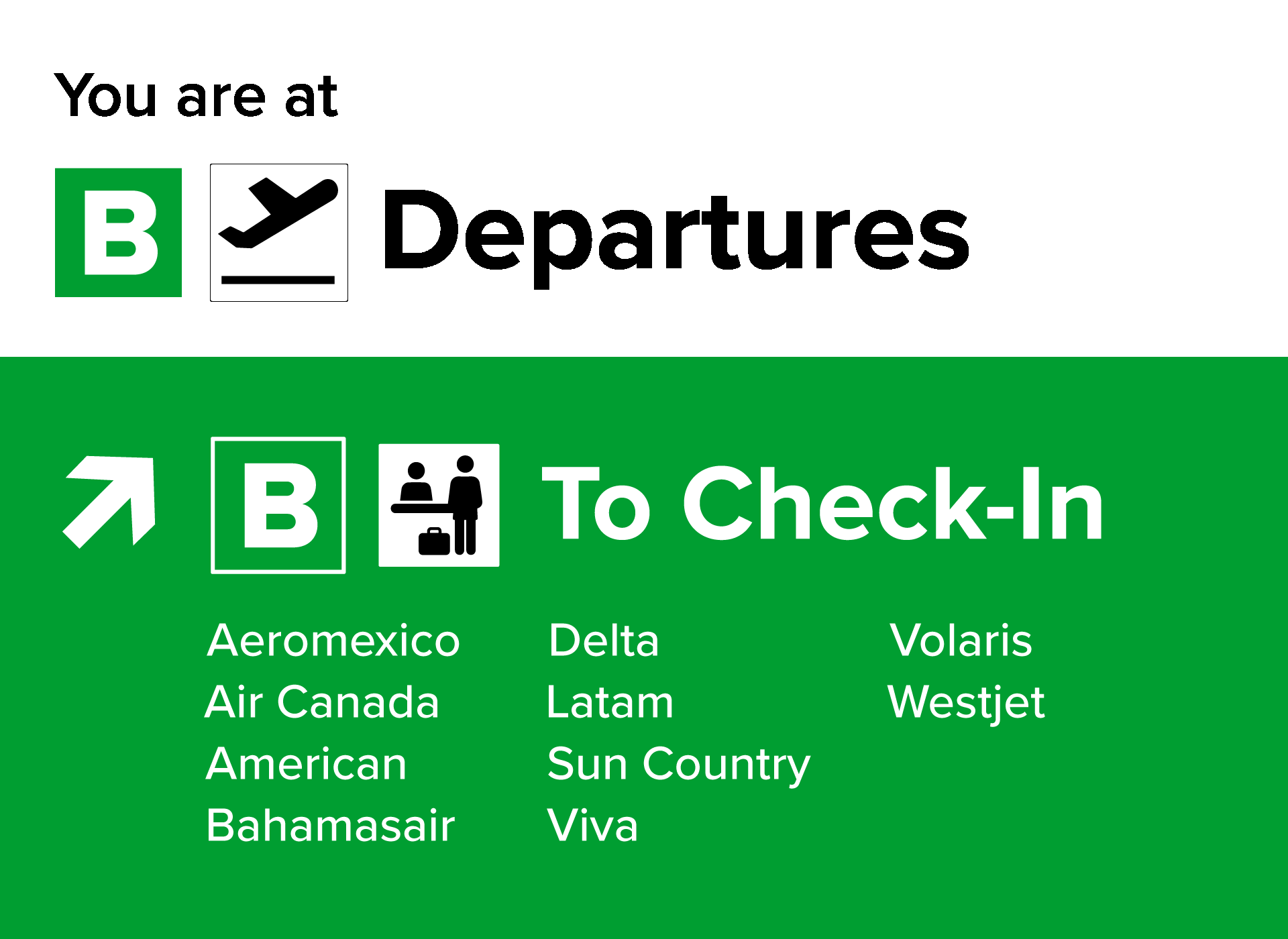
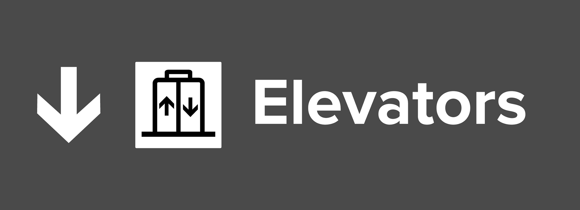



Mockups of new wayfinding solutions, using different colors that correspond with each terminal (orange for Terminal A, green for Terminal B, and blue for Terminal C).
