ROLES
Product Design, UI/UX, Research
TEAM
Kate Lundy (me), Ariel Stull (infographic designs)
TIMELINE
May 2022 – July 2022 (2 months)
Limbitless Solutions is a UCF-affiliated nonprofit that aims to empower kids with limb differences. They achieve this mission by creating affordable bionic arms, running K–12 STEAM education initiatives, and conducting clinical research on bionic technology. This infographic dashboard was designed to show their mission's impact. It is designed to be accessible by both interns and full-time staff, in order to have a more efficient workflow for obtaining data for presentations & literature reviews.
Overview
PROBLEM
Limbitless' data concerning undergraduate interns and clinical trial participants was not centralized and infographics depicting the data had to be manually created every time. The database housing this information is not accessible to undergraduate interns either, posing problems for interns who need to present data for presentations and literature reviews.
SOLUTION
The new infographic dashboard is designed to dynamically pull data directly from Limbitless' internal database, updating charts with new data when necessary. Each dataset on the dashboard is also centralized to easily streamline data as well as providing a variety of filtering options and export options. This eliminates the need for interns to create new infographics from scratch, as well as providing a centralized and accessible place for data.
TOOLS USED

Adobe XD

Google Drive
This case study was written with supervisor approval. Slide deck version coming soon.
Define
Limbitless Solutions utilizes an internal database to keep track of its clinical trial data, undergraduate student intern demographics, and STEAM education initiatives over the years. This data is frequently used in presentations by staff & interns, literature reviews by the Research Team, and in annual reports (the Year in Review) at the end of each fiscal year. The database is only accessible to full-time staff, so undergraduate interns have to obtain the data from them for use in presentations and literature reviews.
PROBLEM #1
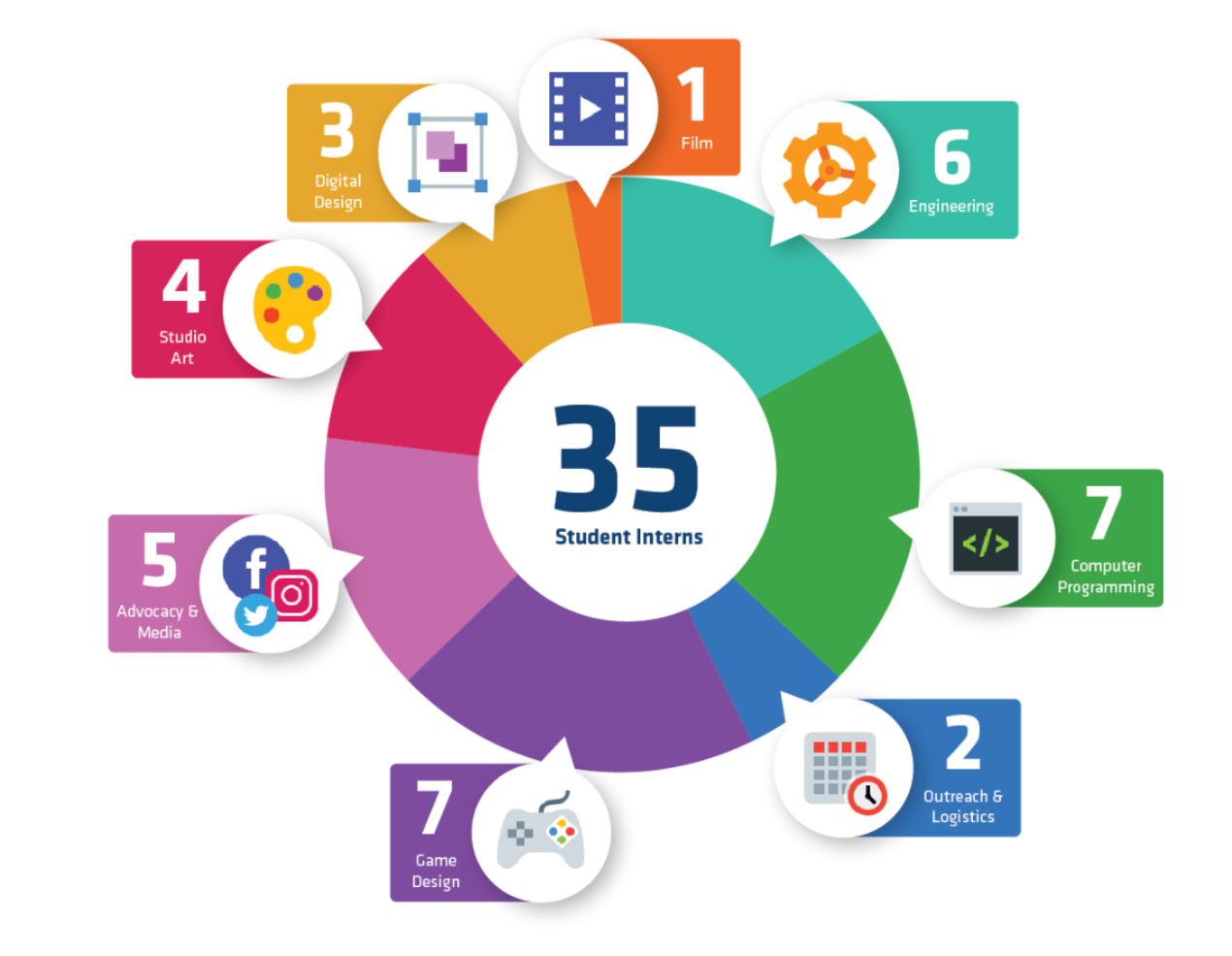
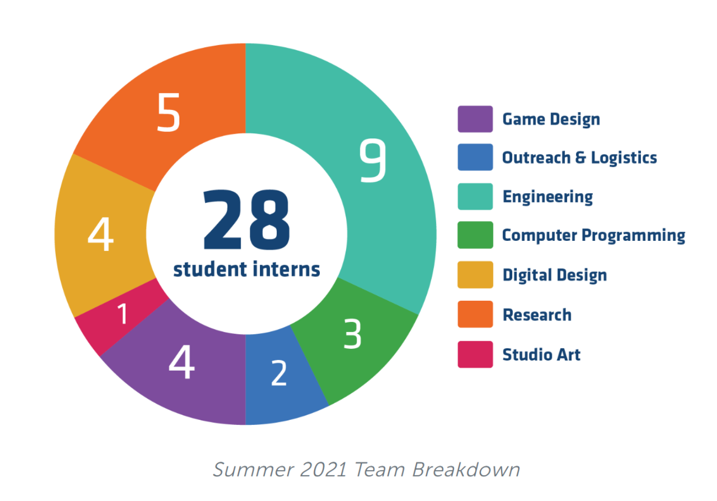
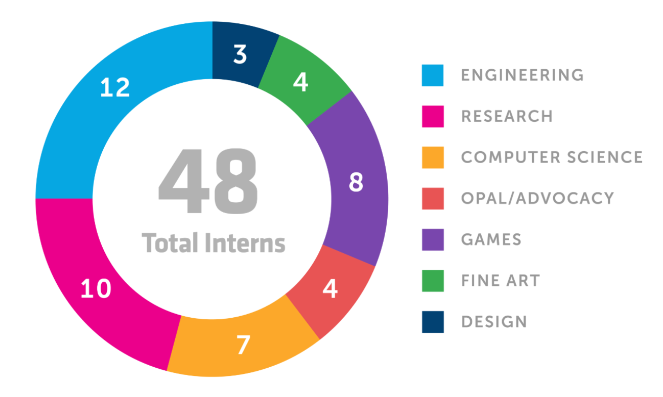
Limbitless' infographics have to be manually created every time new student intern and clinical trial data are available.
While each year's infographics reflect Limbitless' identity & voice over the years, they are inconsistent between the Design Team & Research Team presenting the same data in different ways.
2020 Infographic Sample
2021 Infographic Sample
2022 Infographic Sample
From left to right: 2020, 2021, and 2022 infographic samples.
Upon further discussion, I learned that the current dashboard is only accessible to full-time staff members at Limbitless. The Research Team — the team of student interns at Limbitless that specializes in biomedical research — frequently needs to access data for their presentations and literature reviews. This has helped me identify another particular problem with the current method of obtaining company data at Limbitless:
PROBLEM #2
Undergraduate interns cannot directly obtain data on their own.
Because the database is only accessible by full-time staff, there is no easier method for them to directly obtain data. This can cause some delays in delivering presentations & literature reviews.
The current process to obtain & present data for use — especially from the interns' side — is not the most efficient. From here, opportunities to speed up this process & streamline data more efficiently can be explored. This is where the creation of a new data dashboard comes in. We explored possibilities for a dashboard for interns that constantly pulls data directly from the internal database, creating a "dynamic data dashboard".
DATA VISUALIZATION RESEARCH
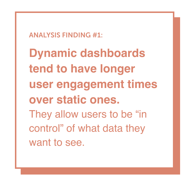
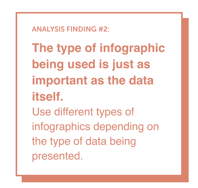
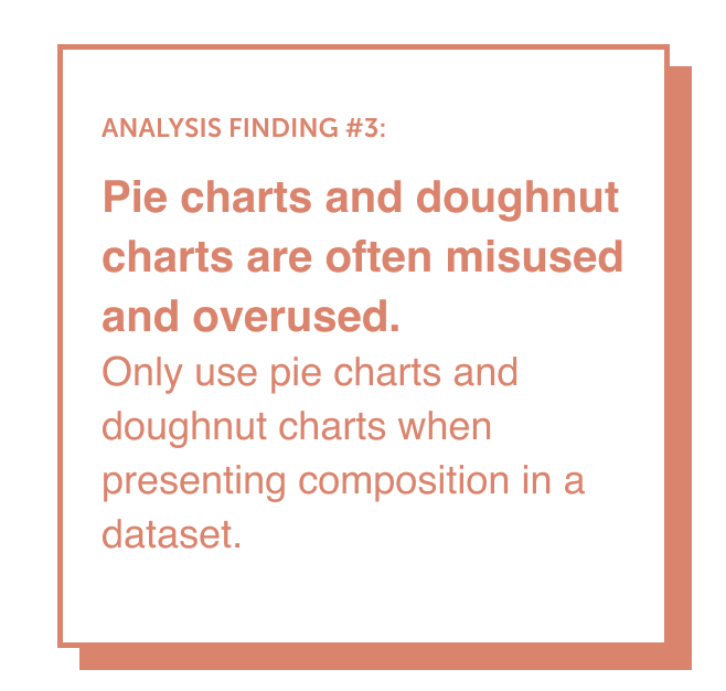
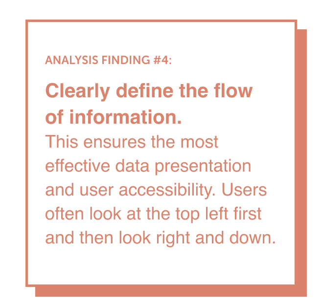
Upon identifying solutions for undergraduate interns to better access data, I realized that effective data visualization also plays a big role in creating an effective data dashboard. I especially paid attention to how each dataset was presented in each chart, which eventually led to researching effective data visualization trends.
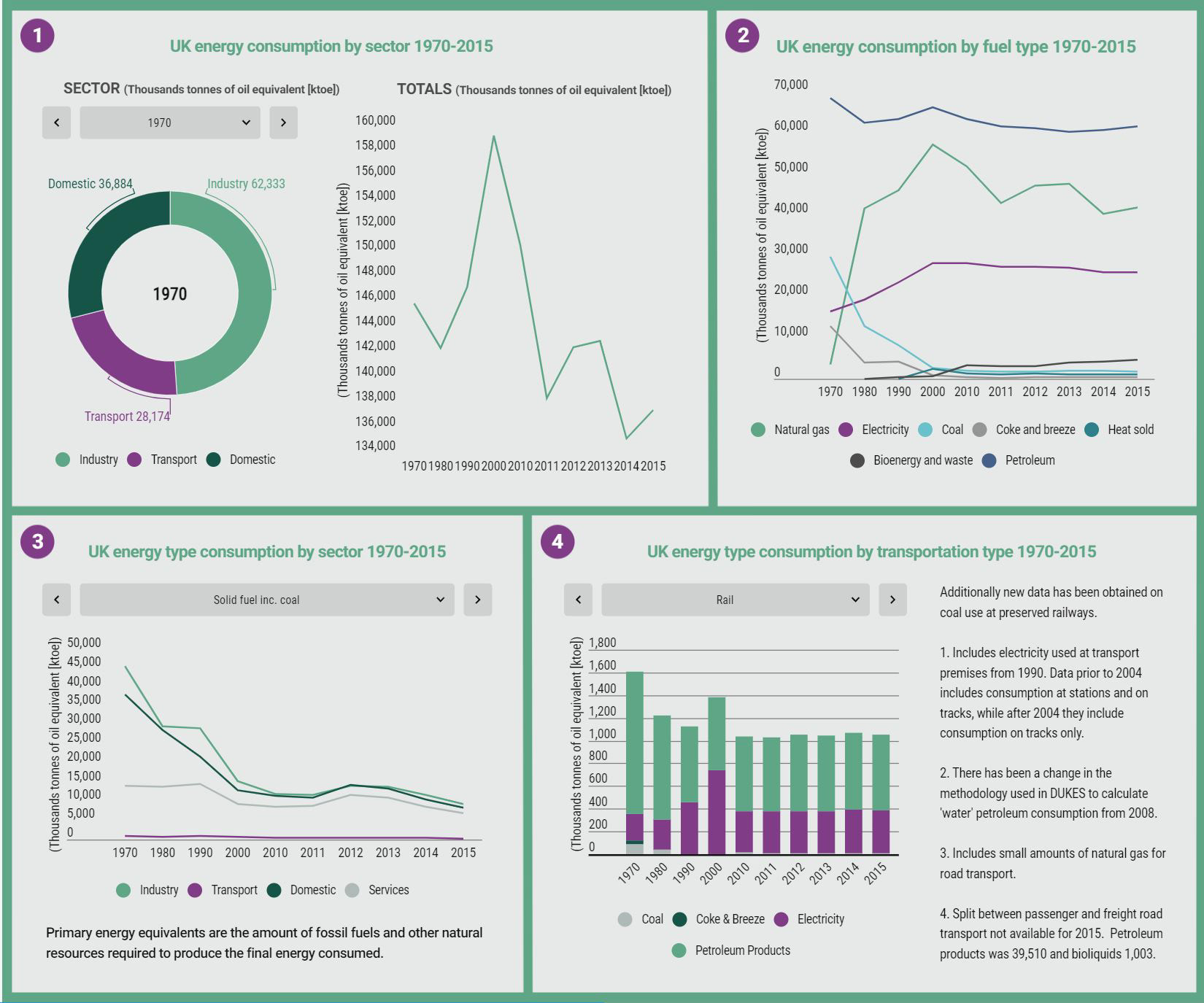
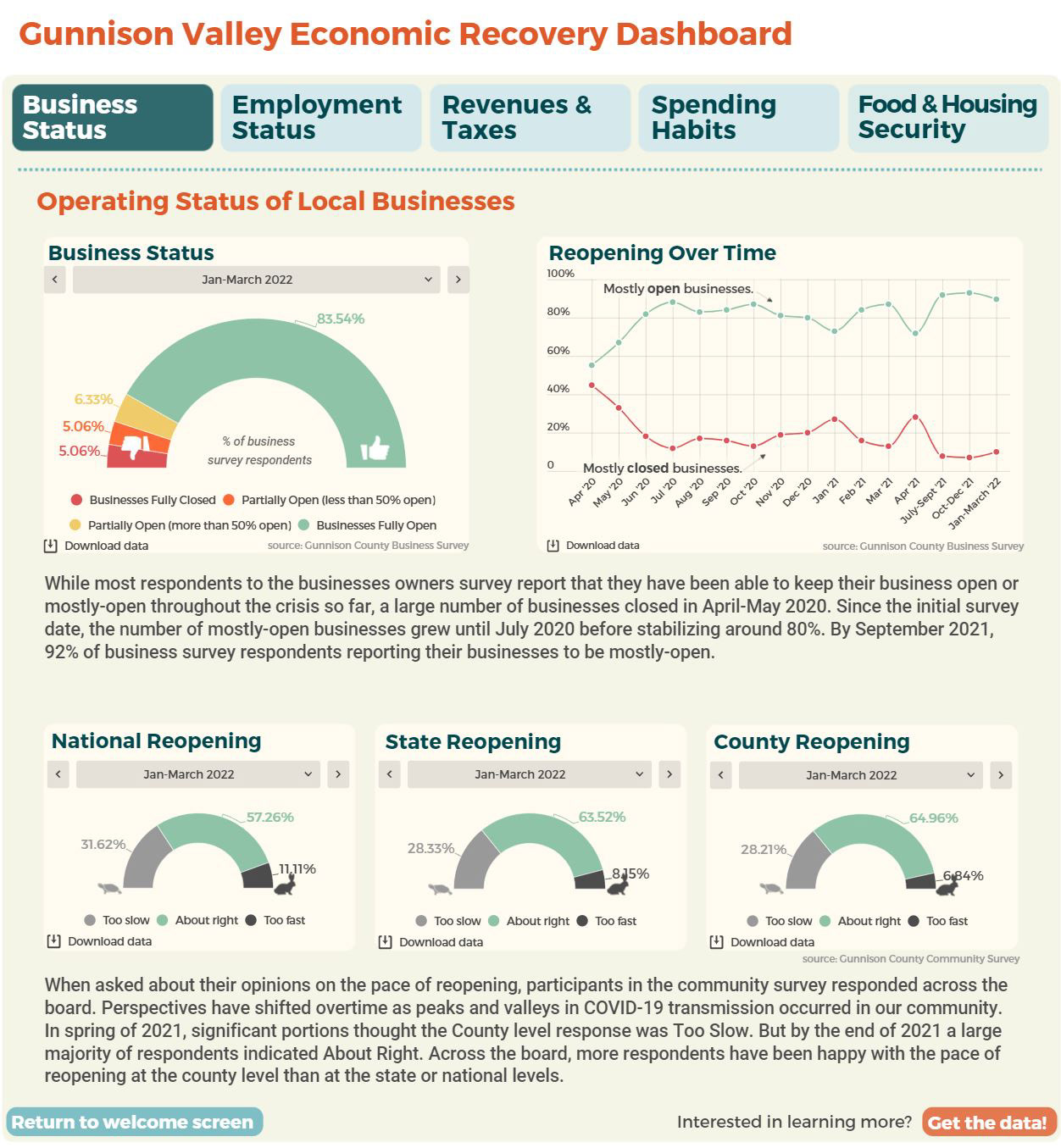
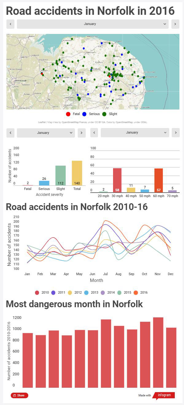
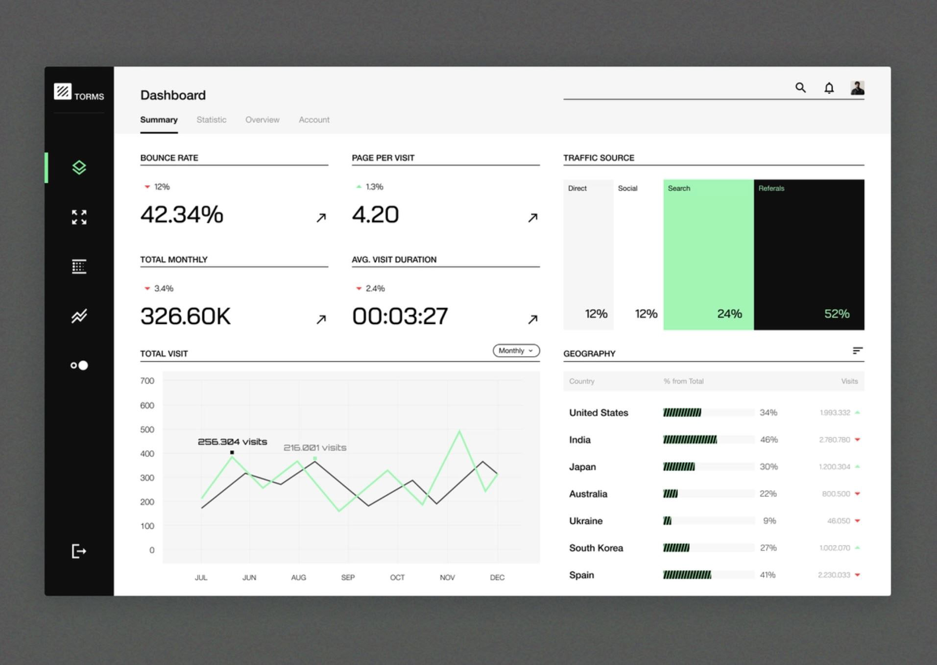
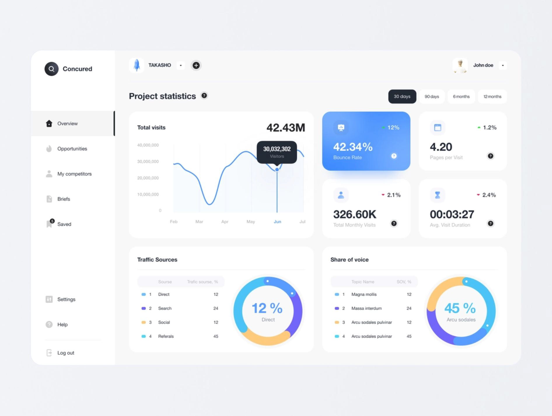
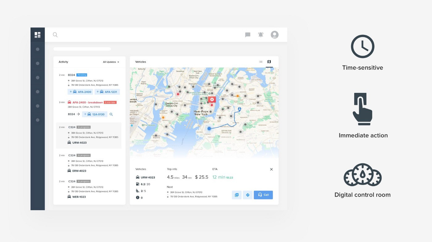
Researching data visualization was parts competitive analysis and studying effective data visualization techniques. To assist me in my analysis, I read various articles on data visualization, courtesy of UX Collective, UX Planet, and Boost Labs. In addition, I continued to find and locate different dashboards made by other companies to apply my analysis and test which dashboards were the most engaging for users.
IDENTIFYING ALL THE NEEDS
How can I create a dynamic infographic dashboard that ensures effective data accessibility for undergraduate interns?
Ideation
INFORMATION ARCHITECTURE
Based on my research into data visualization, I developed this structure for data in the dashboard:
Here it is in action:
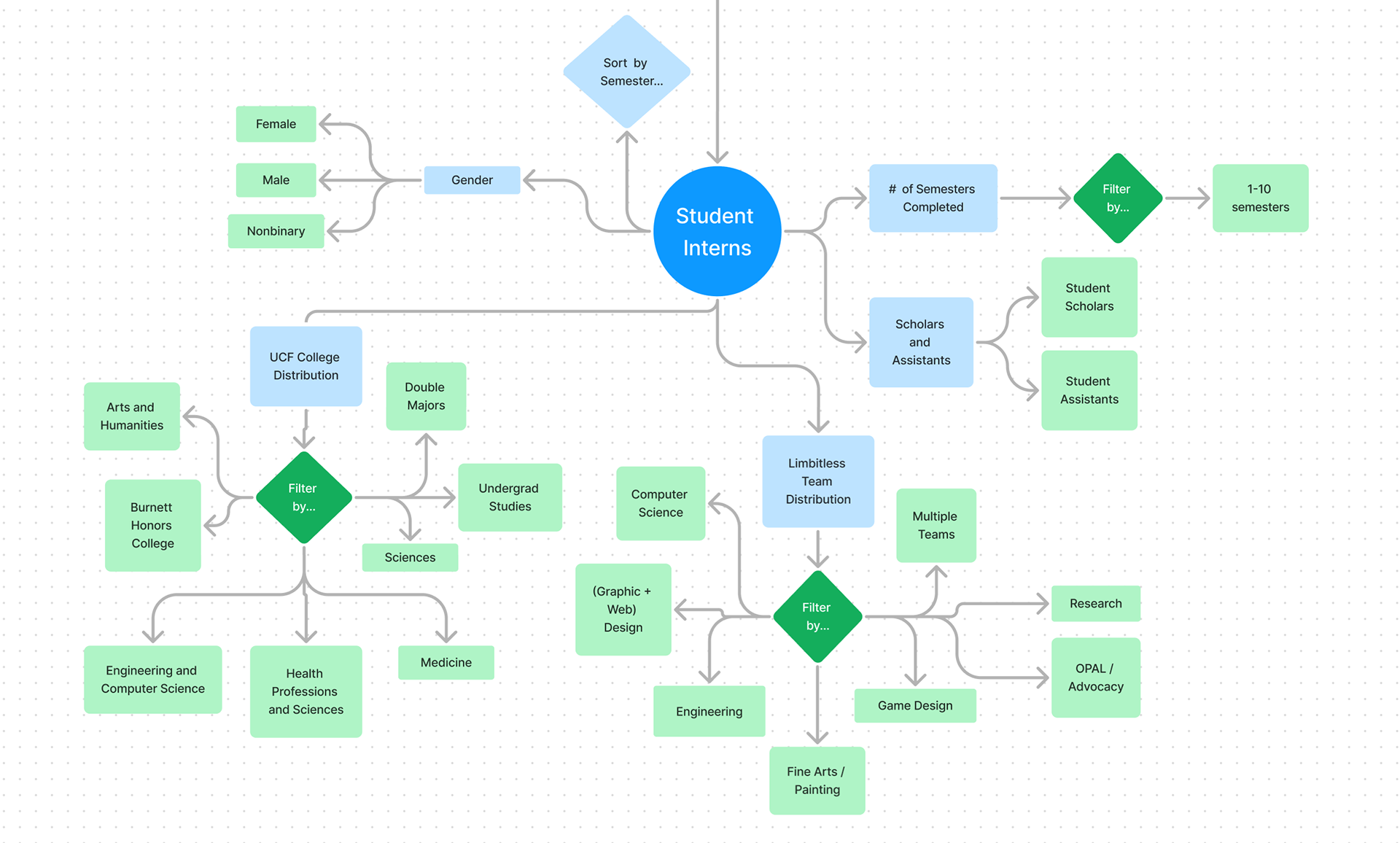
Student Interns Tab
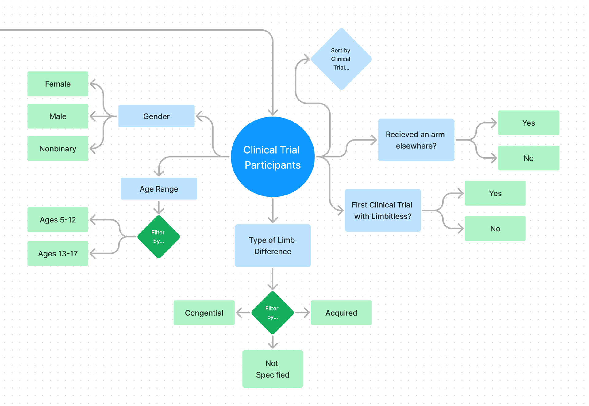
Clinical Trial Participants
ADDITIONAL CONSIDERATIONS
Moving further into ideation, I also considered other possible features to fulfill the needs of the Limbitless team. During this project, I found it very easy to keep jotting down ideas as new ideas kept flowing through.
HOVERING CHART INFORMATION
After filtering certain datasets, hovering over certain parts of their infographics would reveal more specific data pertaining to them. For example: hovering over the College of Engineering & Computer Science in UCF College Distribution would reveal a breakdown of interns’ majors within that college.
DOUBLE MAJORS + MULTIPLE TEAMS FILTERING
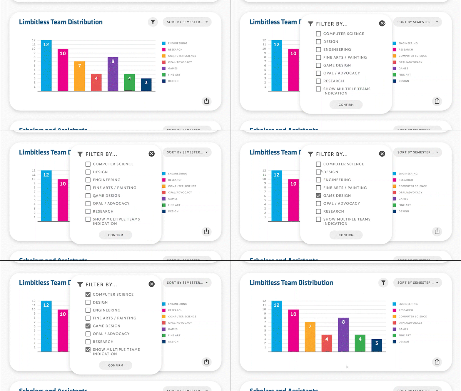
On the UCF Colleges and Limbitless Team widgets (under Student Interns tab), there may be data representing an intern double majoring in two different colleges and/or being a part of two different teams at Limbitless. After toggling their respective indications in the filtering menu, the chart will also change to show them.
Design
LOFI WIREFRAMES
When I started working on the low fidelity wireframes, I first focused on visualizing the hierarchy and basic structure of information of the dashboard. Using the same structure I have used for the information architecture part of the ideation phase, it was very easy for me to apply it into visual design.
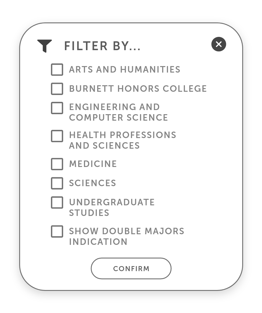
After around three iterations, I have applied more features and refined the basic format of each popup menu, most notably the contents of the filtering menu on the UCF College Distribution widget and adding an export feature for each widget on the dashboard.
SECOND ITERATION: REFINING FILTERING MENUS
The first iteration originally displayed every college and major that UCF offers (as of summer 2022). However, based on feedback, filter modals now only display relevant subcategories for their respective datasets for easier navigation & filter selection.
FINAL ITERATION: ADDITION OF EXPORT FEATURE
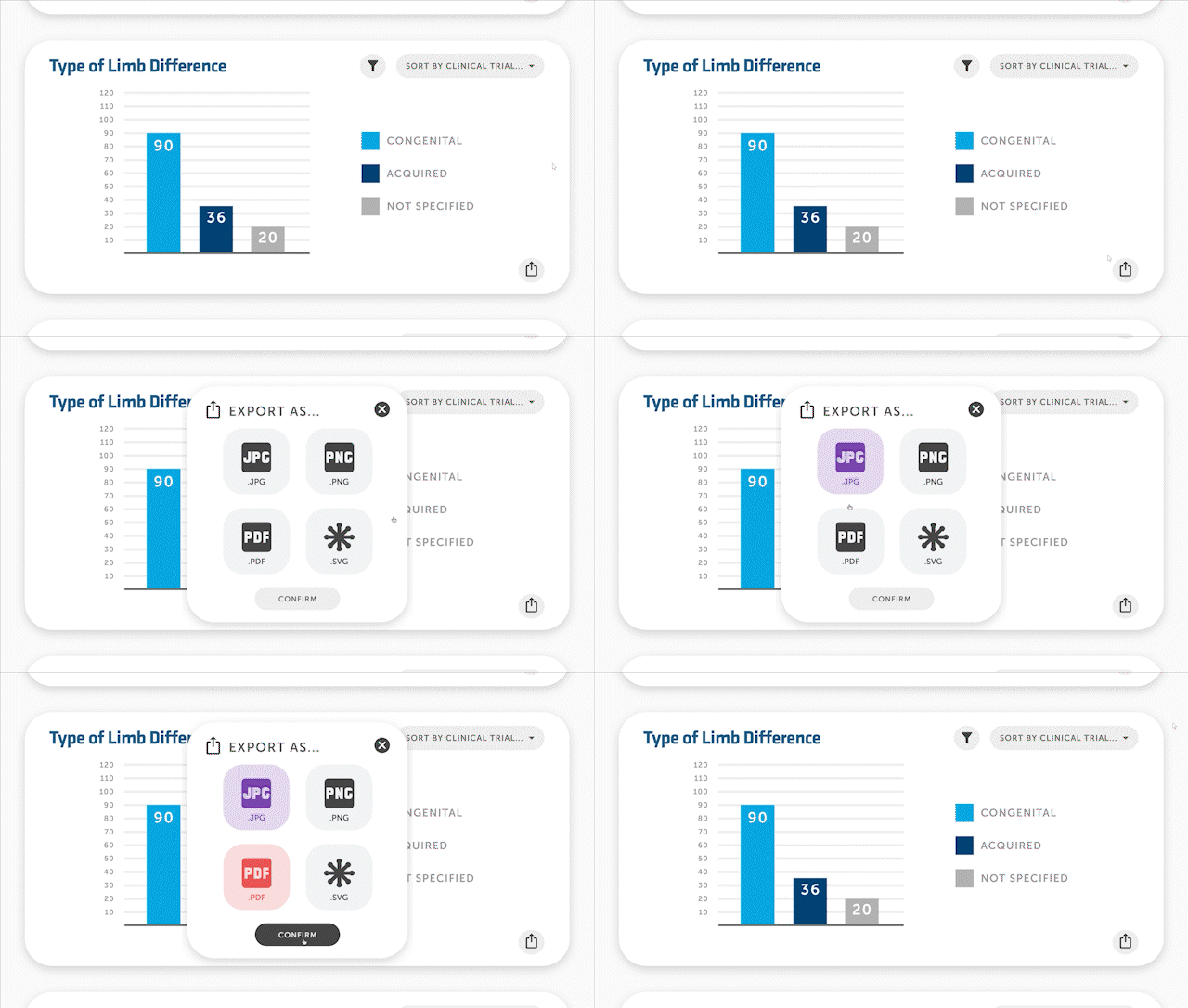
Addition of the export charts feature to each widget. Users can easily export data infographics for print or for web with four common file types: JPG, PNG, PDF, or SVG.
HIFI WIREFRAMES
The type of infographics displayed in each widget is how the charts on the dashboard are intended to be displayed. With further input I also created a dark mode version of the dashboard, as the internal website also features a dark mode setting.
DESIGN SYSTEM
The dashboard's design system followed along with Limbitless' branding and Material Design guidelines, to keep it consistent with the rest of the internal website. Blues, whites, and grays were primarily used throughout the dashboard to fit the innovative spirit of Limbitless, while other colors were mainly used for to differentiate data being displayed in each infographic.
FINAL DESIGNS: USING THE DASHBOARD
SOLUTION #1
Two tabs in one place.
View student intern and clinical trial data on two different tabs, conveniently found at the top of the dashboard.
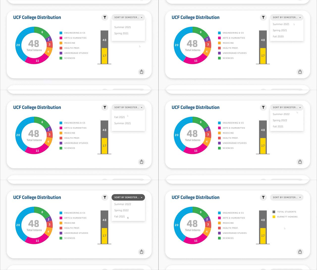
SOLUTION #2
Sorting over time.
To view data over time, sort by semester or sort by clinical trial using a dropdown menu in the top right corner of each widget.
SOLUTION #3
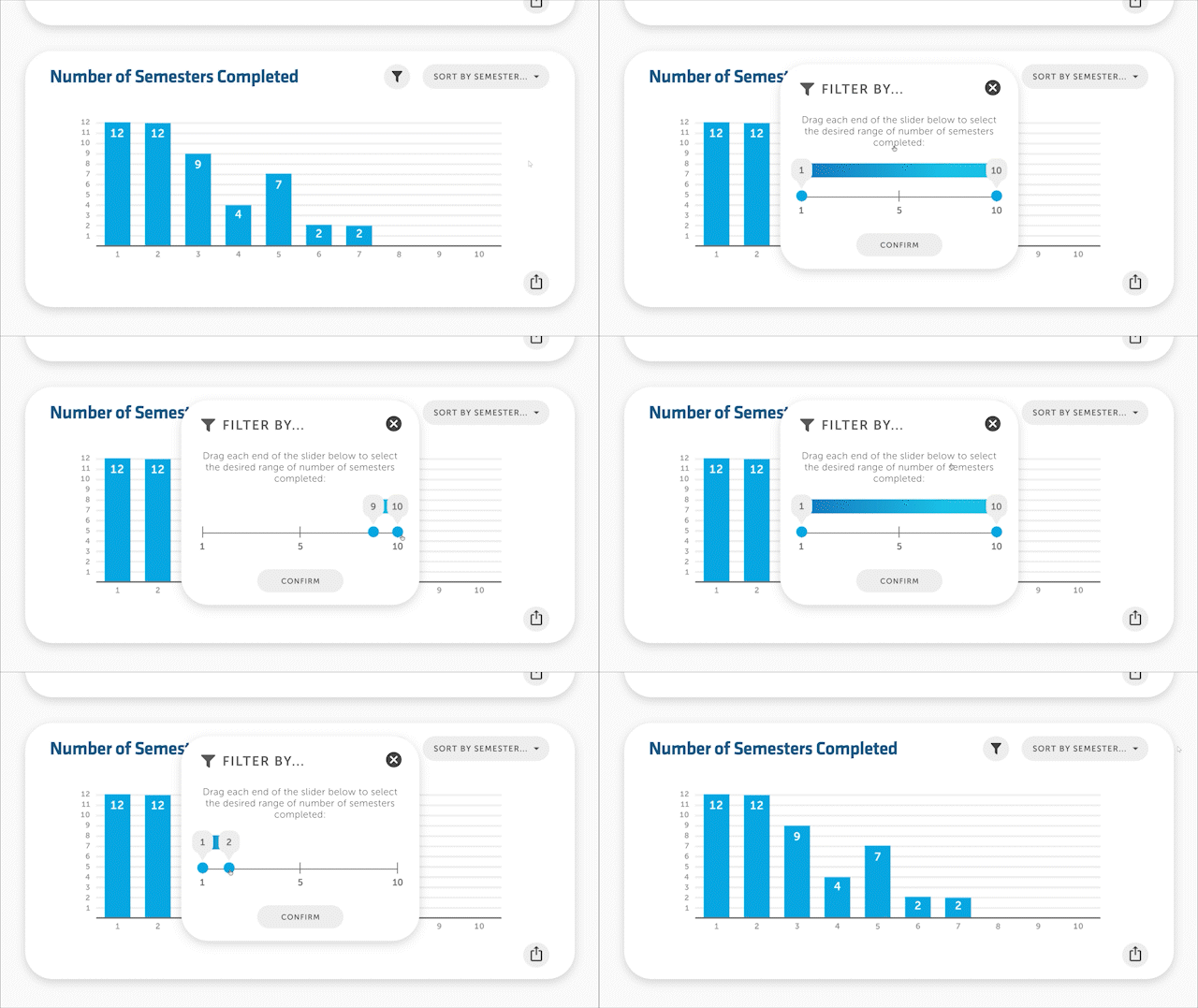
Filtering specific data.
Filter specific data in each widget in addition to sorting by semester or clinical trial in many dashboard widgets. Check boxes or use number sliders to filter the desired specific data.
SOLUTION #4
Exporting dynamic infographics.
Export the the infographics in each widget, with any specific filtering combinations applied. Choose from four common file types: JPG, PNG, PDF, and SVG. Ideal for presentations.
Reflection
Data visualization is much more than it seems. It is much more than finding random charts for presentations — the type of data and the flow of information being presented needs to be considered. One cannot just tack on pie charts for everything, they need to make sure it is easy to understand yet meaningful to the data!
Source: Taras Bakusevych, UX Planet.
With this project also being my first time working with design systems for UI, it was very eye-opening to see how easy it was to use them to keep each screen consistent throughout UI design projects. Before, I thought it was necessary to create everything from scratch — right down to each icon on the screen — however I realized that it is not necessary to "reinvent the wheel" when designing, especially in UX and UI. I have also learned that more established design systems, such as the Material Design System, have many standards designers need to put in place before handing projects off to developers and eventually publishing them.
This project was a great learning experience for working with design systems. However, I would like to expand more on testing the dashboard's design to ensure compliance with Web Content Accessibility Guidelines (WCAG), as Limbitless Solutions places great emphasis on accessible design to ensure those with limb differences are able to interact with its interactive experiences.
NEXT STEPS
Since my internship at Limbitless concluded in December 2022, the dashboard may have undergone further changes to its user experience & user interface. This is likely a result of the changing needs of Limbitless’ staff and interns. Regardless, this project has laid down the foundations for a more accessible and dynamic database for Limbitless’ undergraduate interns. In turn, it could become a more useful tool for interns & staff to help reflect on the growth of Limbitless overall.
Special thanks to...
Mrudula Peddinti, my supervisor who helped guiding me on my first major project at Limbitless.
Ariel Stull, another design intern who designed Limbitless' infographics for 2022.
